your data visualised
Welcome to DashedUp® – a visually engaging data-analysis tool that presents your business data in clear and interactive infographics.
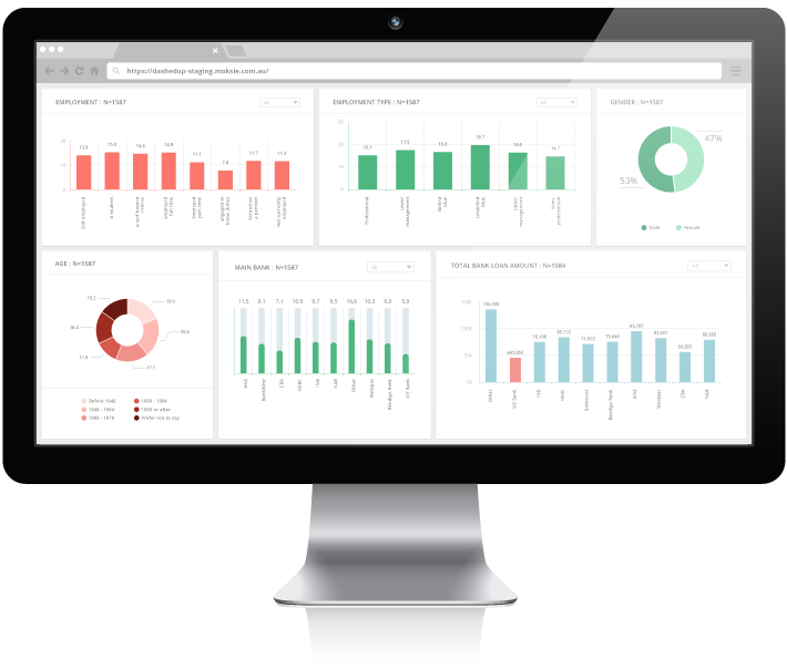
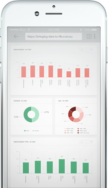
DashedUp® customized dashboards offer powerful ways to visually communicate and act upon your customer data.
Why limit yourself to Powerpoint reports when DashedUp® can help you reveal your big data picture with visually engaging infographics and powerful drilldown data reports.
DashedUp® allows you to pull together your reports using many data sources e.g. social media, sales, market research so that you have a more complete picture of your data. Moksie can help you customize your dashboards so that you produce exactly the information you need for the people who need it.
what DashedUp® Can do


